This course will teach you how to harness the power of visualization in R to explore data and to present your findings to others. In addition to learning the mechanics of learning to write code for visualizations, you will also learn how to use the art of visualization to tell a story with your data. We will be focusing on learning how to use ggplot2, one of the the most popular R packages, to produce a variety of high quality visualizations.
Topics include:
Building a plot in layers with ggplot2
Implementing the Grammar of Graphics in R
Visualization strategies for univariate, bivariate, and multivariate data
Histograms, boxplots, and kernel density plots for visualizing the distribution of continuous variables
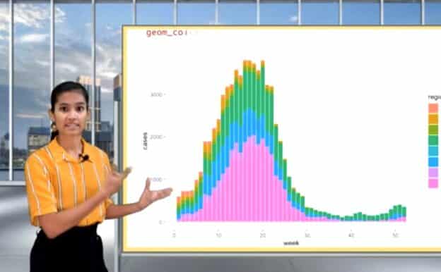
Simple, stacked, and grouped barplots for visualizing the distribution of discrete variables
Scatterplots and linegraphs for visualizing the relationship between two continuous variables
Time series plots to visualize epidemic trends
Grouping and faceting plots to visualize relationships among three or more variables
Customizing plots with labels, color palettes, and themes
During the beta release, new lessons will be made public periodically.